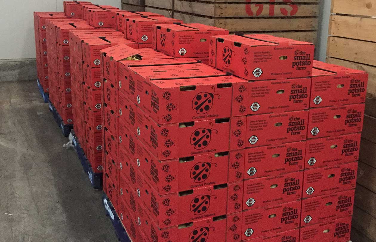
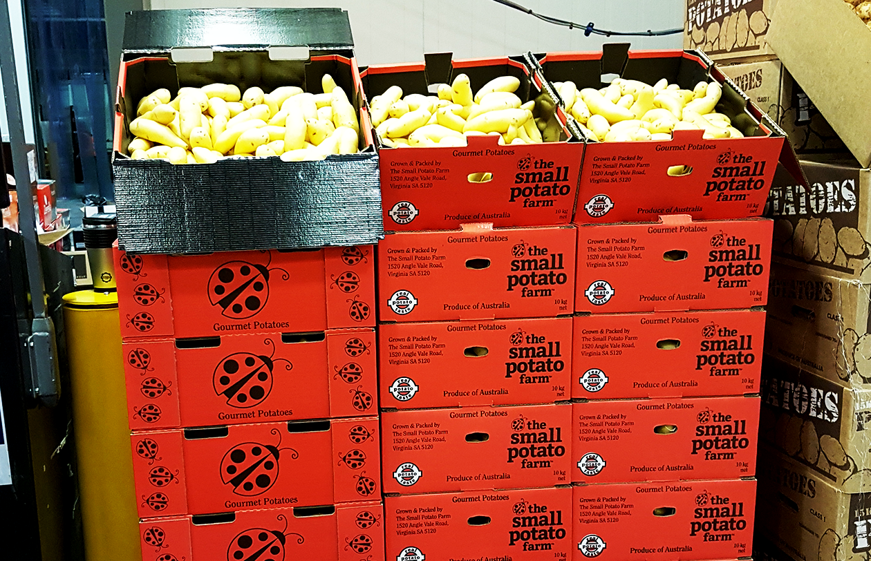
The Small Potato Farm branding

Project: Logo for the Small Potato Farm
The challenge
The Small Potato Farm guys wanted a logo that visually described their operation. “We’re the little guys,” they said, “we still get out in the field ourselves. Our product is something we care about enough to be hands on. We’ve got dirt underneath our fingernails!”

Our Process
When designing the logo for The Small Potato Farm we incorporated a ladybug, an insect that although small, is very industrious and beneficial to farming.
A perfect metaphor and very apt, the ladybug is also able to be used stand alone on the packaging.
The typography also reflects the industrious nature of the business but the use of all lower case makes it more approachable and friendly. The cheeky Latin subscript translates as, “Heroes come in all sizes”.
Results
The client tells us their distinctive brand and packing stands out amongst the competition and helps them ‘punch above their weight’ in a highly competitive market.


